Rotating earth using pure CSS
Recently after seeing a pen on codepen by Jack Rugile and a creation on CSSDeck by Tim Holman, I thought why not use the two concepts to come up with something interesting. An illusion of a 3D rotating planet using just CSS. And so I hacked down a pen (this does a little more than mentioned, not nicely enough though).
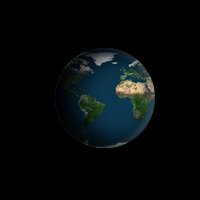
I thought may be I should share the little CSS tricks being used in this CSS stuff to create the illusion. And here I am with a short walkthrough. Lets begin.
This demo uses a single div tag for the HTML. So lets start by creating a div tag with an ID earth.
<div id="earth" />Thats it. Our markup is done. Time for some CSS now. Lets break this part into numbered steps.
STEP 1:
Lets give our earth some dimensions. Give it a width and height of 100 pixels. Also give a temporary background of blue color just to know what it is becoming.
#earth {
  width: 100px;
  height: 100px;
  background: blue;
}
STEP 2:
Earth isn't all that square for sure. Lets make it a perfect circle by giving it a border-radius of 50%.
#earth {
  width: 100px;
  height: 100px;
  background: blue;
  border-radius: 50%;
}
STEP 3:
Much better now. But still doesn't looks like our earth. Yeah, you're right...we need a texture. Lets pick an earth texture to put on our present blue circle. I have selected this image here for this tutorial (you could use any of your choice). Set the image as the background of our div instead of the blue color we have.
#earth {
  width: 100px;
  height: 100px;
  background: url(http://www.noirextreme.com/digital/Earth-Color4096.jpg);
  border-radius: 50%;
}
Step 4:
Ahh, all we see is a blue color still. Why? Well that is because the texture we are using is quite big for a 100x100 earth. We need to scale down the background a bit. Lets try giving it a background-size of something according to our dimensions. I find 210 pixels to be a fit here.
#earth {
  width: 100px;
  height: 100px;
  background: url(http://www.noirextreme.com/digital/Earth-Color4096.jpg);
  border-radius: 50%;
  background-size: 210px;
}
Step 5:
Seems better. But our earth still looks all flat. Time to give it some 3D feel by adding some lighting. For this we use box-shadow CSS property. Give it an inner blackish shadow from left.
#earth {
  width: 100px;
  height: 100px;
  background: url(http://www.noirextreme.com/digital/Earth-Color4096.jpg);
  border-radius: 50%;
  background-size: 210px;
  box-shadow: inset 16px 0 40px 3px black;
}
To make it more realistic, add another white shadow from right side, a subtle one with some opacity.
#earth {
  width: 100px;
  height: 100px;
  background: url(http://www.noirextreme.com/digital/Earth-Color4096.jpg);
  border-radius: 50%;
  background-size: 210px;
  box-shadow: inset 16px 0 40px 3px rgb(0, 0, 0), inset -3px 0 6px 2px rgba(255, 255, 255, 0.2);
}
Step 6:
Now that looks like our earth. One final thing we will do is...rotate it. How? CSS Animations to the rescue. We first need to define our own animation keyframes which essentially means telling which CSS property will change to what value and at what time. But wait! What CSS property can we use to make a rotation animation?
Well, the rotation illusion is actually created by simply scrolling the background image horizontally which is by default tiled both horizontally and vertically. Hence we make use of background-position-x CSS to do so. Add the following CSS to define the animation keyframes which we call rotate:
@keyframes rotate {
  from {
    background-position-x: 0px;
  }
  to {
    background-position-x: 210px;
  }
}
So here we are defining our animation to change the background-position from 0px when animation cycle starts to 210px when cycle ends. Why we chose 210px for the final value? Remember that is the size we set for our background-image. So for a seamless scrolling we shift the background image equal to its width.
Step 7:
Nothing happens though because we have not yet used the above defined animation. To use it, we set the animation-name CSS property to our animation name (rotate).
#earth {
  width: 100px;
  height: 100px;
  background: url(http://www.noirextreme.com/digital/Earth-Color4096.jpg);
  border-radius: 50%;
  background-size: 210px;
  box-shadow: inset 16px 0 40px 3px rgb(0, 0, 0), inset -3px 0 6px 2px rgba(255, 255, 255, 0.2);
  animation-name: rotate;
}
Then we define the time it should take for one animation cycle using animation-duration property. Set a value of 4 seconds for the same.
#earth {
  width: 100px;
  height: 100px;
  background: url(http://www.noirextreme.com/digital/Earth-Color4096.jpg);
  border-radius: 50%;
  background-size: 210px;
  box-shadow: inset 16px 0 40px 3px rgb(0, 0, 0), inset -3px 0 6px 2px rgba(255, 255, 255, 0.2);
  animation-name: rotate;
  animation-duration: 4s;
}
Notice here how the animation plays just once and stops. We must tell the animation to play in an infinte loop using the animation-iteration-count property.
#earth {
  width: 100px;
  height: 100px;
  background: url(http://www.noirextreme.com/digital/Earth-Color4096.jpg);
  border-radius: 50%;
  background-size: 210px;
  box-shadow: inset 16px 0 40px 3px rgb(0, 0, 0), inset -3px 0 6px 2px rgba(255, 255, 255, 0.2);
  animation-name: rotate;
  animation-duration: 4s;
  animation-iteration-count: infinite;
}
One final adjustment to make the animation smooth, set the animation-timing-function to linear.
#earth {
  width: 100px;
  height: 100px;
  background: url(http://www.noirextreme.com/digital/Earth-Color4096.jpg);
  border-radius: 50%;
  background-size: 210px;
  box-shadow: inset 16px 0 40px 3px rgb(0, 0, 0), inset -3px 0 6px 2px rgba(255, 255, 255, 0.2);
  animation-name: rotate;
  animation-duration: 4s;
  animation-iteration-count: infinite;
  animation-timing-function: linear;
}
And we are done! You may give the body a black background to get a feel of space. Also you can make different planets by just changing the background texture. So go and make some cool CSS planets.
Finally, some light discussion about the demo on Hacker News.
Earth image credits: http://www.noirextreme.com/earth
Cheers!