Getting started with Chart.js
I had been recording data from Alexa since Hint.css went live just to track its popularity and reach. Nothing too complex, just maintained a JSON file and added new object in an array for each data point. I had been thinking if I could visualize this data, just for fun. Did try d3.js. Though its a really awesome library for data visualization and all, it surely has some learning curve before you can have something out of it.
Then today I thought, lets try chart.js which had been on HN sometime back. And I must say, its so easy to get started with it and that is probably the reason I am writing this post for anyone who wants to do some chart work really really quick.
Here is what I did.
This is the sample of data I had which I wanted to visualize:
[
  {
    date: "15-12-2012",
    rank: 1896594,
    "sites-linking": 50
  },
  {
    date: "17-12-2012",
    rank: 1895639,
    "sites-linking": 50
  },
  {
    date: "09-02-2013",
    rank: 413592,
    "sites-linking": 47
  },
  {
    date: "12-02-2013",
    rank: 327643,
    "sites-linking": 55
  },
  {
    date: "14-02-2013",
    rank: 313141,
    "sites-linking": 55
  },
  {
    date: "15-02-2013",
    rank: 292197,
    "sites-linking": 55
  },
  {
    date: "25-02-2013",
    rank: 242294,
    "sites-linking": 88
  },
  {
    date: "26-02-2013",
    rank: 234704,
    "sites-linking": 88
  },
  {
    date: "02-03-2013",
    rank: 213869,
    "sites-linking": 100
  }
];
First thing I did was clone the github repo for Chart.js:
git clone git://github.com/nnnick/Chart.js.git
cd Chart.js
In the repo, you'll find a samples/ folder which has some examples of using Chart.js. I needed a line chart, so I opened samples/line.html in Sublime and started reading the code. It was such little code which created a sweet little line graph with subtle animations.
This was the old JS there:
var lineChartData = {
  labels: ["January", "February", "March", "April", "May", "June", "July"],
  datasets: [
    {
      fillColor: "rgba(220,220,220,0.5)",
      strokeColor: "rgba(220,220,220,1)",
      pointColor: "rgba(220,220,220,1)",
      pointStrokeColor: "#fff",
      data: [65, 59, 90, 81, 56, 55, 40]
    },
    {
      fillColor: "rgba(151,187,205,0.5)",
      strokeColor: "rgba(151,187,205,1)",
      pointColor: "rgba(151,187,205,1)",
      pointStrokeColor: "#fff",
      data: [28, 48, 40, 19, 96, 27, 100]
    }
  ]
};

var myLine = new Chart(document.getElementById("canvas").getContext("2d")).Line(
  lineChartData
);
Next what I did was get my data into that script. So I simply made a variable and assigned my object to it. Also to begin with, I removed one of the data set entry from the array so I can visualize just the rank key:
var myData = [
    {
      date: "15-12-2012",
      rank: 1896594,
      "sites-linking": 50
    },
    {
      date: "17-12-2012",
      rank: 1895639,
      "sites-linking": 50
    },
    {
      date: "09-02-2013",
      rank: 413592,
      "sites-linking": 47
    },
    {
      date: "12-02-2013",
      rank: 327643,
      "sites-linking": 55
    },
    {
      date: "14-02-2013",
      rank: 313141,
      "sites-linking": 55
    },
    {
      date: "15-02-2013",
      rank: 292197,
      "sites-linking": 55
    },
    {
      date: "25-02-2013",
      rank: 242294,
      "sites-linking": 88
    },
    {
      date: "26-02-2013",
      rank: 234704,
      "sites-linking": 88
    },
    {
      date: "02-03-2013",
      rank: 213869,
      "sites-linking": 100
    }
  ],
  lineChartData = {
    labels: ["January", "February", "March", "April", "May", "June", "July"],
    datasets: [
      {
        fillColor: "rgba(220,220,220,0.5)",
        strokeColor: "rgba(220,220,220,1)",
        pointColor: "rgba(220,220,220,1)",
        pointStrokeColor: "#fff",
        data: [65, 59, 90, 81, 56, 55, 40]
      }
    ]
  };
If you note in the above code where lineChartData is being created, values corresponding to the data we want to visualize are arrays. To be specific, its the label and data keys in that object. So we need to convert our data into arrays which could be assigned to those 2 keys.
For that I made a small function called mapProperty (inspired from Emberjs) which basically maps the array with only the passed property values.
Array.prototype.mapProperty = function(property) {
  return this.map(function(obj) {
    return obj[property];
  });
};

// Example: myData.mapProperty('rank') to get an array of all ranks
Now all I had to do is use the above function to map my data on appropriate key and assign in the lineChartData:
lineChartData = {
  labels: myData.mapProperty("date"),
  datasets: [
    {
      fillColor: "rgba(220,220,220,0.5)",
      strokeColor: "rgba(220,220,220,1)",
      pointColor: "rgba(220,220,220,1)",
      pointStrokeColor: "#fff",
      data: myData.mapProperty("rank")
    }
  ]
};
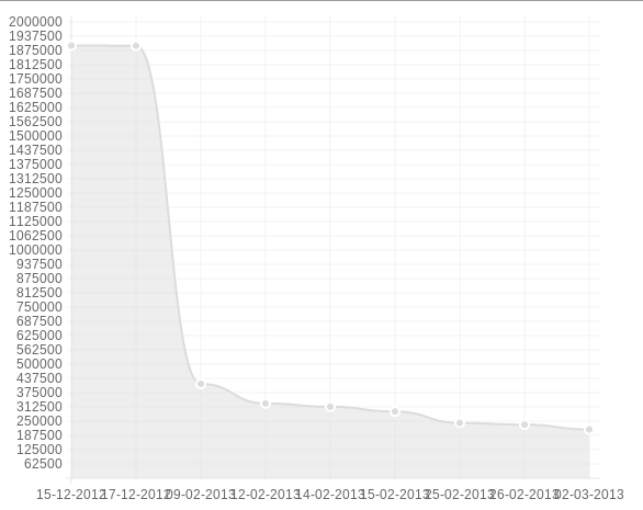
I refreshed the page in browser and voila! My data was converted into a beautiful chart. Wasn't that dead simple?

I added another dataset entry for the sites-linking, but rank values being much larger than sites-linking key, it made the sites-linking line almost invisible.
To sum up,
Good: easy to use, fast, nice animations, multiple chart types
Bad: no tooltips, no interactivity
Its still a new library and has a long way to go. It has been receiving contributions from Open Source developers and I think it will evolve into a cool visualization library soon.
Cheers :)
