10* commandments for efficient CSS architecture
Yes, CSS can have architecture too!
Kushagra Gour @chinchang457
* Conditions apply.
/me
- My name is Kushagra Gour. Better know as chinchang on the web.
- I am from
Delhi, India


/me more
- I am a Front-end developer at a wonderful startup called Wingify.
- Open-source stuff like Hint.css and piCSSel-art.
Whats this talk about?
Keep File Sizes Small
"Thy height shalt remain greater than thy file sizes at all times"
Keep File Sizes Small
Why?
- It helps keeping things modular.
- Important for faster search in future because you know where things are when something needs to be changed.
What?
Keep dividing and refactoring files as and when they get too big.
1st day of christmas
style.css
4th day of christmas
base.css
helpers.css
components.css
theme.css
mixins.scss (SASS)
8th day of christmas
base.css
helpers.css
components/
- buttons.css
- dropdowns.css
- tooltips.css
theme.css
12th day of christmas

Use Variables
Thy code config shalt remain at one place.
Use Variables
Your layout:
HEADER
CONTENT
.header {
	width: 100%;
	height: 50px; // Magic number
}

.sidebar {
	width: 100px; // Magic number
	height: 100%;
	top: 50px;  // Magic number
}

.content {
	top: 50px; // Magic number
	bottom: 0;
	left: 100px; // Magic number
	right: 0;
}
Too many magic numbers!
Use Variables
Better approach
$header-height: 50px;
$sidebar-width: 100px;

.header {
	width: 100%;
	height: $header-height;
}

.sidebar {
	width: $sidebar-width;
	height: 100%;
}

.content {
	top: $header-height;
	bottom: 0;
	left: $sidebar-width;
	right: 0;
}
Use Variables
Better approach
$header-height: 50px;
$sidebar-width: 100px;

.header {
	width: 100%;
	height: $header-height;
}

.sidebar {
	width: $sidebar-width;
	height: 100%;
}

.content {
	top: $header-height;
	bottom: 0;
	left: $sidebar-width;
	right: 0;
}- Less error prone
- Easy extensibility
Component Abstraction
Thou shalt believe in abstractions
Component Abstractions
Scenario: HUD elements on a game screen
.hud-stats {
	position: fixed;
	opacity: 0.7;
	filter: sepia(90%);
	bottom: 20px;
	left: 20px;
}

.hud-map {
	position: fixed;
	opacity: 0.7;
	filter: sepia(90%);
	top: 20px;
	right: 20px;
}
Component Abstractions
Scenario: HUD elements on a game screen
.hud-stats {
	position: fixed;
	opacity: 0.7;
	filter: sepia(90%);
	bottom: 20px;
	left: 20px;
}

.hud-map {
	position: fixed;
	opacity: 0.7;
	filter: sepia(90%);
	top: 20px;
	right: 20px;
}
Too much repeatition.
Component Abstractions
Don't Repeat yourself
Component Abstractions
HUD elements on a game screen (Better)
.hud-element {
	position: fixed;
	opacity: 0.7;
	filter: sepia(90%);
}

.hud-stats {
	bottom: 20px;
	left: 20px;
}

.hud-map {
	top: 20px;
	right: 20px;
}
<div class="hud-element hud-stats">9999</div>No repeation. Much cleaner.
Component Abstractions
HUD elements on a game screen (Better)(SASS)
%hud-element {
	position: fixed;
	opacity: 0.7;
	filter: sepia(90%);
}

.hud-stats {
	@extend %hud-element;
	bottom: 20px;
	left: 20px;
}

.hud-map {
	@extend %hud-element;
	top: 20px;
	right: 20px;
}
<div class="hud-stats">9999</div>Keep Selector Strengths Low
Thou shalt spread peace and stop thy selectors from fighting.
Keep Selector Strengths Low
Selectors have strengths...and they do fight!
Example:
div.tabs {
	width: 100%;
}
<div class="tabs"></div>.tabs-half {
width: 50%;
}<div class="tabs tabs-half"></div>WON'T WORK!
strength(div.tabs) > strength(.tabs-half)
Keep Selector Strengths Low
How things get messier...
Either prefix your class name with DIV tag.
Use the all 'awesome and criticized'
!importantPlus, tabs can only be made up of DIV tags.
Keep Selector Strengths Low
No div.tabs
Simply have .tabs
.tabs
Naming Convention
Thou shalt treat your classes as thy own children. Name them with equal love.
Naming Convention
- Most important thing in CSS. Much more important than any other languauge.
- Some things are bad in CSS (ahem...!important) and can be eliminated through better naming.
Naming Convention
BEM
to the rescue
Naming Convention
BEM: Block - Element - Modifier
Supports Component abstraction
Naming Convention
BEM: Naming
Naming Convention
BEM - Example - Without BEM
.slider { position: relative; }

.slider .slider-track { background: white; }

.slider .knob { position: absolute; }

// Variation
.slider.slider-with-input .slider-input { display: block; }
Naming Convention
BEM - Example - With BEM
.slider { position: relative; }

.slider__track { background: white; }

.slider__knob { position: absolute; }

// Variation
.slider--with-input .slider__input { display: block; }
Selectors - Less specific. More uniform.
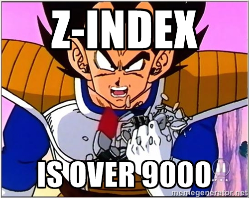
z-index Management
Thou shalt not mix up thy ego and z-indexes
z-index Management
Issue?
z-index Management
Separate them out into your config as variables
$z-index-overlay: 1;
$z-index-slideout-backdrop: 1;
$z-index-slideout: 1;
$z-index-sidebar: 2; // above help panel for tooltips
$z-index-navigation: 4; // top of sidebar
$z-index-header: 4;
$z-index-modal-underlay: 4; // Below modal-box & top of others.
$z-index-modal-box: 5; // on top of everything
z-index Management
-
Changing existing z-indexes become really easy because you know what might break.
-
Setting z-index for new UI elements is very easy because you can actually position it in a similar hierarchy.
z-index Management
No more
z-index: 99999;
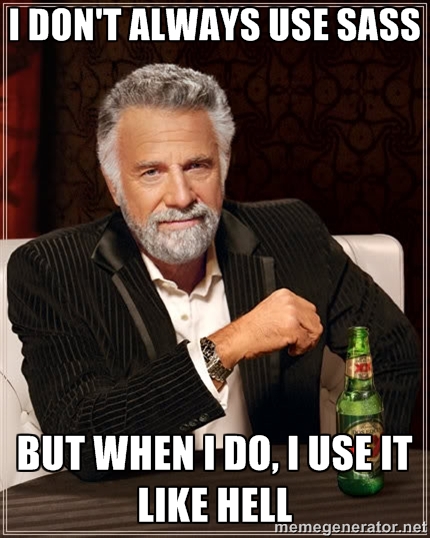
@extend - Avoid Selector Hell
Inheritance doesn't always gives thou $$$$.
@extend - Avoid Selector Hell
Simple example:
SASS
.error {
	color: red;
	background: #ff8888;
}

.sidebar {
	.error {
		padding: 10px;
	}
}

.error-notification {
	@extend .error; // GONNA BE BAD!!!
}
@extend - Avoid Selector Hell
Result
SASS:
.error {
	color: red;
	background: #ff8888;
}

.sidebar {
	.error {
		padding: 10px;
	}
}

.error-notification {
	@extend .error;
}
CSS:
.error, .error-notification {
	color: red;
 	background: #ff8888;
}

.sidebar .error,
.sidebar .error-notification {
	padding: 10px;
}
Unnecessary CSS generated
This is REAL!
@extend - Avoid Selector Hell
Solution: Use placeholders
SASS:
%error {
	color: red;
	background: #ff8888;
}

.error {
	@extend %error;
}

.sidebar {
	.error {
		padding: 10px;
	}
}

.error-notification {
	@extend %error;
}
CSS:
.error, .error-notification {
	color: red;
	background: #ff8888;
}

.sidebar .error {
 	padding: 10px;
}
@extend - Avoid Selector Hell
We reduced compilation time by 76%
Play Time :)
Press 'g'